Juice Box Lifting Club
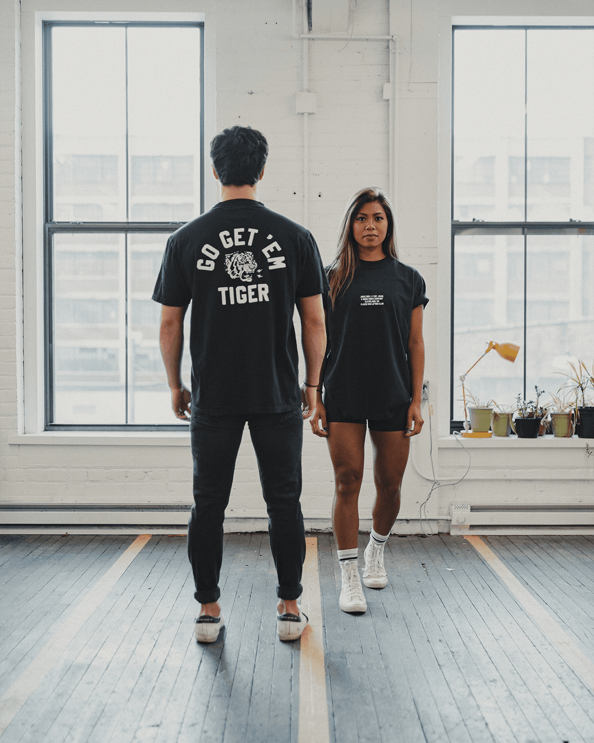
Two athletes in Juice Box Lifting Club tees, one showing the Go Get 'Em Tiger back print
CLIENT

Juice Box Lifting Club

ROLE

Founder

Lead Designer

Creative Director

YEAR

2020–2022

SERVICES

Brand Identity

Product Design

Content & Campaign

Photography

E-commerce

/ Context

Context

01

A fitness apparel brand that started by handing you a juice box.

A fitness apparel brand that started by handing you a juice box.

/ Problem

Problem

02

In 2020, fitness apparel spoke in one register: aggression. Dark palettes, hyper-masculine messaging, intimidation as a selling point. The unspoken message was that the gym is for a certain kind of person. As a competitive bodybuilder who believed the weight room should feel welcoming to everyone, I saw the gap. No brand held both things at once: real intensity, and the humor of not taking yourself too seriously.

In 2020, fitness apparel spoke in one register: aggression. Dark palettes, hyper-masculine messaging, intimidation as a selling point. The unspoken message was that the gym is for a certain kind of person. As a competitive bodybuilder who believed the weight room should feel welcoming to everyone, I saw the gap. No brand held both things at once: real intensity, and the humor of not taking yourself too seriously.

/ Approach

Approach

03

The name was the design brief. Inspired by Gym Class Heroes, a juice box is nostalgic, universal and slightly absurd. Nobody looks cool drinking one. I paired that anti-cool energy with a vintage athletic direction pulled from varsity letterman culture, old gym posters and early streetwear. Vintage signals trust and belonging without saying a word. It says this has been around, and it will still be around.

The name was the design brief. Inspired by Gym Class Heroes, a juice box is nostalgic, universal and slightly absurd. Nobody looks cool drinking one. I paired that anti-cool energy with a vintage athletic direction pulled from varsity letterman culture, old gym posters and early streetwear. Vintage signals trust and belonging without saying a word. It says this has been around, and it will still be around.

/ The Work

The Work

04

IDENTITY

Badges signal membership, and for a brand called a club it was the natural format. The type had to hold the tension between athletic authority and playful warmth, and work on a chest print, an Instagram post, a thank-you card and a hang tag without losing its character.

THE TIGERS

Tough enough to train, relaxed enough to laugh at itself. In a market full of vector-sharp graphics, the hand-drawn texture made JBLC feel different. The Tigers became the recurring character of every seasonal drop.

PRODUCT & MANUFACTURING

Custom cut-and-sew meant learning to build tech packs from scratch: measurements, placement coordinates, Pantone calls, materials, stitching and labels. Two to three rounds of sampling got us to production-ready specs. The run: 500+ custom hoodies, 200 branded beanies and 100 custom lifting straps.

CONTENT & COMMERCE

The store carried the same energy as the brand: light, fun, never corporate. I directed and shot every campaign with local Cleveland athletes, bodybuilders and creatives, then edited in Photoshop and Premiere Pro. Real people, real environments, zero artifice.

COLLABS & CAMPAIGNS

With ILTHY, one of Cleveland's most respected streetwear labels, I co-designed “Support Your Local Lifter,” a riff on their iconic “Support Your Local Art Dealer” graphic. Designing inside someone else's visual language while making it my own was one of the best constraints I've worked within. The Cheat Day Giveaway pushed the brand into a new audience. Hard training, serious food.

/ Outcome

Outcome

05

$20K

Annual revenue at peak

300+

Customers

500+

Custom hoodies made

“Plenty of brands made you feel like you had to earn your place. I wanted to build one that started by handing you a juice box.”

/ Reflection

Reflection

06

A brand is a system, not a logo. The hardest part of Juice Box wasn't the mark. It was holding one identity together across two years of products, platforms, collaborators and campaigns. It held. The brand still gets requests to come back and has turned down multiple acquisition offers. Every physical thing we made started as a design file, and every constraint, from vinyl cutting to tech packs, made the work sharper. I've done a lot of cool things. This one still lives with me.

A brand is a system, not a logo. The hardest part of Juice Box wasn't the mark. It was holding one identity together across two years of products, platforms, collaborators and campaigns. It held. The brand still gets requests to come back and has turned down multiple acquisition offers. Every physical thing we made started as a design file, and every constraint, from vinyl cutting to tech packs, made the work sharper. I've done a lot of cool things. This one still lives with me.

BUILD. billboard reading Your idea deserves better than your notes app
NEXT CASE STUDY

BUILD. →