Unrefined

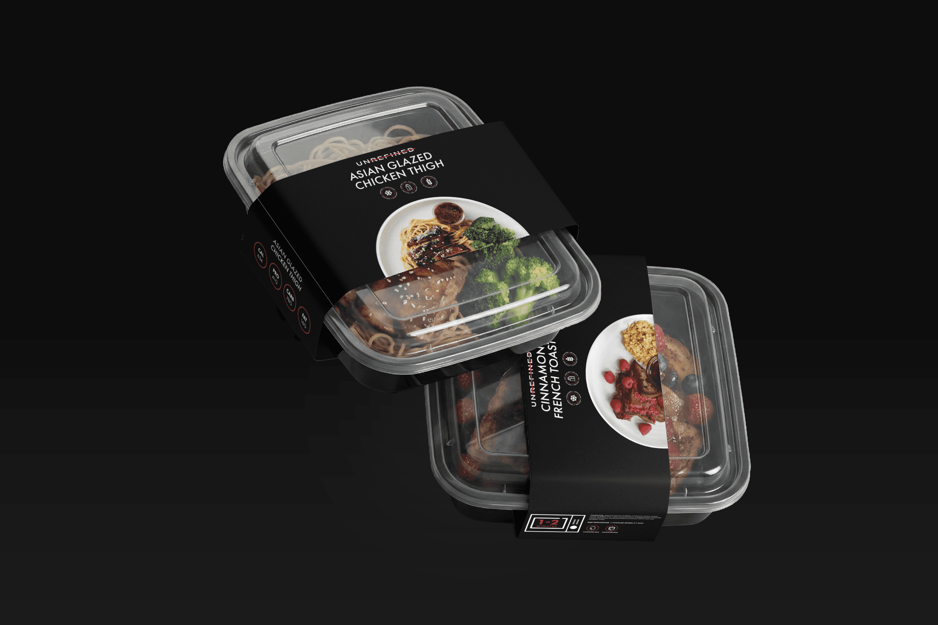
Unrefined meal containers wrapped in black branded sleeves
CLIENT

Unrefined

ROLE

Brand Designer

Graphic Designer

Packaging Designer

YEAR

2022–2023

SERVICES

Packaging Design

Brand Collateral

Print Design

Event Design

Social Media

/ Context

Context

01

Making a meal-prep brand impossible to miss, from the cooler to the trade show.

Making a meal-prep brand impossible to miss, from the cooler to the trade show.

/ Problem

Problem

02

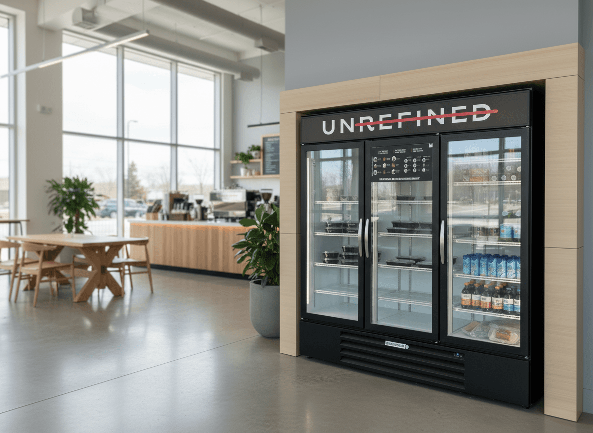
A cooler in a gym lobby has about two seconds to make its case. Unrefined's food was good and its brand already existed, but it wasn't working hard enough in the places that mattered. People needed to see what was inside, what was new and why it was worth grabbing, often from across the room. And every new menu meant new materials, fast.

A cooler in a gym lobby has about two seconds to make its case. Unrefined's food was good and its brand already existed, but it wasn't working hard enough in the places that mattered. People needed to see what was inside, what was new and why it was worth grabbing, often from across the room. And every new menu meant new materials, fast.

/ Approach

Approach

03

Work inside the brand, but make it louder. I refined the existing logo so it held up at every size, from a meal sleeve to a trade show banner, and stayed within the established colors. Then I built every piece around two goals: legible at a glance and appetizing up close. The product photography did the selling. The layouts stayed out of its way.

Work inside the brand, but make it louder. I refined the existing logo so it held up at every size, from a meal sleeve to a trade show banner, and stayed within the established colors. Then I built every piece around two goals: legible at a glance and appetizing up close. The product photography did the selling. The layouts stayed out of its way.

/ The Work

The Work

04

LOGO REFINEMENT

The goal wasn't a new identity. It was making the one they had work harder. A cleaner, sturdier version of the mark gave every piece of packaging and print the same anchor.
PACKAGING

Each sleeve does three jobs: says what the meal is, makes the brand recognizable inside the cooler, and keeps the food the hero. The dark sleeves let the color of the meals show through the clear containers.

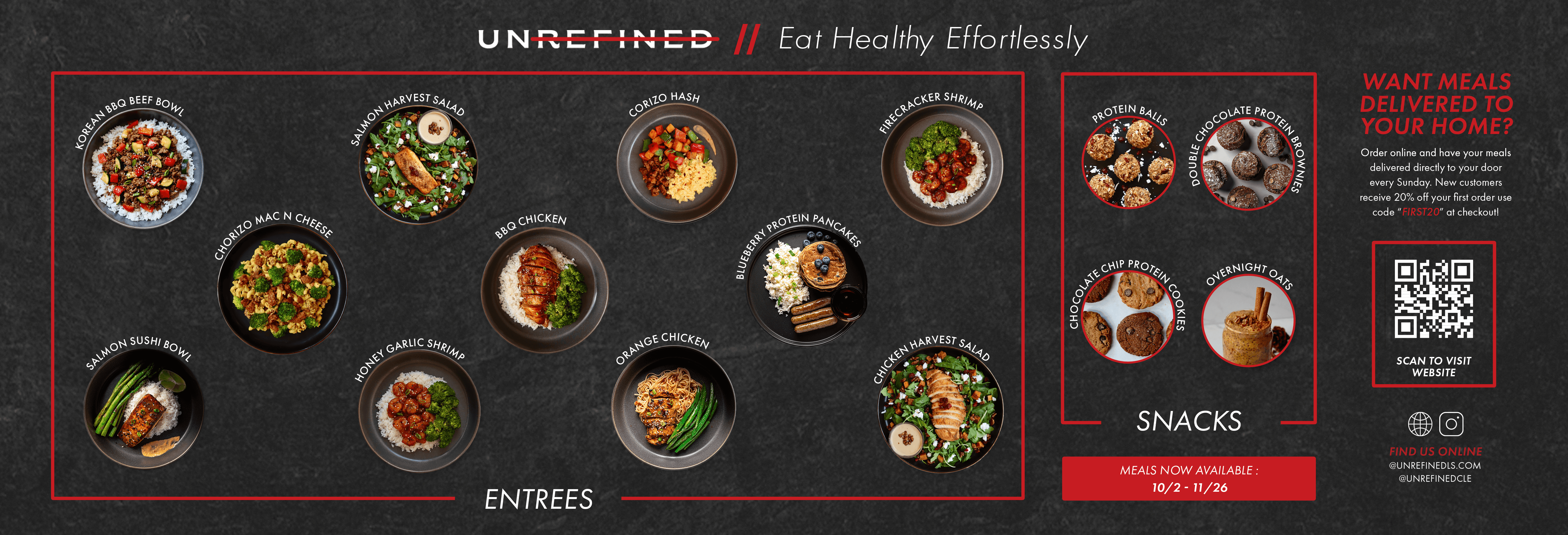
COOLER MENUS

The most important piece. Menus rotated weekly and monthly, so the layouts had to be quick to update and easy to read from a distance. Product photography up front, clear dish names and one simple promise: eat healthy, effortlessly.

PRINT & EVENTS

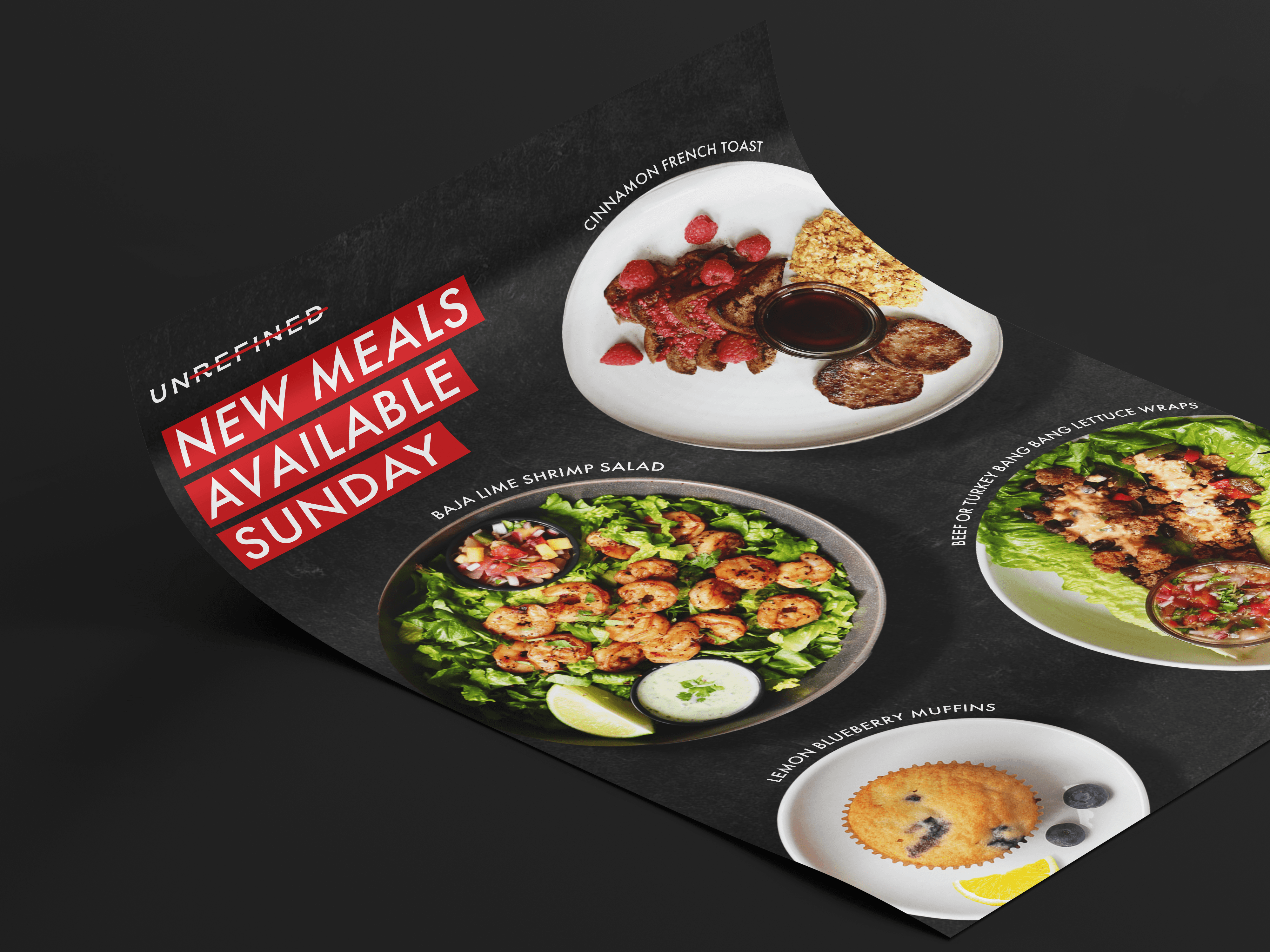
Wherever Unrefined showed up, it looked like the same brand. New-meal flyers kept regulars coming back, and the event kit made a pop-up table feel as considered as the packaging.

SOCIAL

The social content carried the cooler menus online, announcing new meals and keeping the brand consistent from the feed to the fridge.
/ Outcome

Outcome

05

“Eat healthy, effortlessly.”

/ Reflection

Reflection

06

Not every project is a blank canvas. Unrefined already had a brand. My job was to make it work harder in the real world: in a cooler, in a gym, across a busy café. Designing inside existing guidelines taught me that consistency is its own kind of creativity. When the same system shows up on every sleeve, menu and banner, people recognize it before they read it.

Not every project is a blank canvas. Unrefined already had a brand. My job was to make it work harder in the real world: in a cooler, in a gym, across a busy café. Designing inside existing guidelines taught me that consistency is its own kind of creativity. When the same system shows up on every sleeve, menu and banner, people recognize it before they read it.

Lovely Night Ent. flyer with the heart and record logo on indigo
NEXT CASE STUDY

Lovely Night Ent. →